Featured Works
The Pull of Abstraction: Why Expression Still Matters
Every so often, colour pushes its way back into the spotlight. Not polite colour. Not the sort chosen to “soften a room.” The kind that feels charged. The kind that arrives with a pulse. The kind that tells you the artist was working from instinct rather than caution.
Lately we have noticed more people gravitating towards abstract works with real energy behind them. Paintings where colour is the starting point, not the finishing touch. You see it in broad sweeps of pigment, in forms that seem to shift as you look at them, in compositions built from intuition rather than rules.
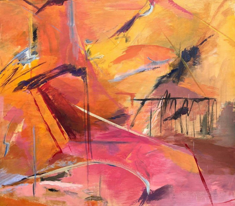
Colourful Abstract Artisan-Style Painting
A layered, expressive composition with movement and depth. Bold colour handled with real sensitivity.
View the artwork here
These paintings do not try to imitate the world. They respond to it. A block of orange that seems to burn. A chord of blue and green that settles the eye. A sudden interruption of pink that changes everything around it. These choices feel deliberate, but they also feel alive.
There is something refreshing about this kind of work in winter. The days grow shorter and the light loses its strength, and people often want something inside their homes that pushes back a little. Bold colour acts almost like a heat source. It lifts a wall. It anchors a room. It brings energy into spaces that can feel quiet at this time of year.

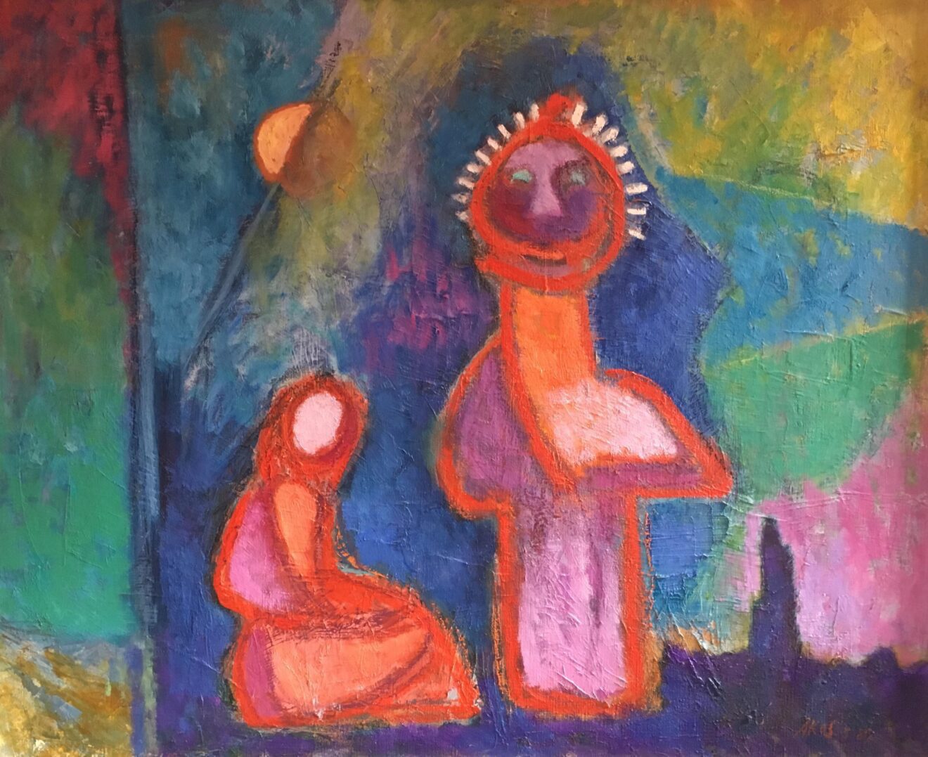
1980s French Geometric Abstract
A clean, structured composition built from strong colour relationships. A modern, graphic take on expressive colour.
View the artwork here
Abstract expressionism is sometimes thought of as chaotic, but many of these paintings are remarkably controlled. A tight geometric structure can hold a palette together. A single shift in tone can soften an entire composition. Even the most energetic surface often reveals calmness underneath once you slow down and look again.
Colour is one of the quickest ways people connect with art. Buyers will walk through a room full of paintings and still return to the same square of yellow or the same line of red. Something in it stays with them. You do not need a background in art theory to recognise that pull. You simply feel it.
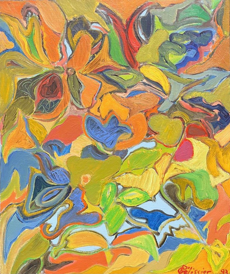
Vibrant Abstract with Orange, Yellow, Green and Blue
A rhythmic, swirling abstract with rich colour and dynamic movement. A piece with real presence.
View the artwork here
If abstract and colour-led works are what draw you in, take time with them. Notice how the shapes sit beside one another. Look for the moments where the paint thickens or thins. These are often the places where the feeling of the painting sits.
We have gathered a small edit of expressive abstract pieces for anyone looking to explore this side of the gallery. Each one has its own rhythm, its own weight and its own way of using colour as emotion rather than decoration.
Shop Abstract Expressionist Works